The 2022 BMW 2 Series is Here-But BMW Design is MIA
The BMW 2 Series is here, and it prompts one to ask, “What’s going on with BMW design?” In some ways, the 2 is better than its predecessor. But in others, it is way worse. So what’s happening anyway?
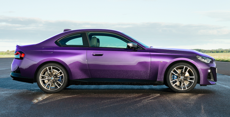
In profile, the 2 Series is a vast improvement over the previous design

When you look at the profile of the new 2022 230i or M240i you can see it is instantly better. The previous 2 had that weird sculpted indent in the lower doors that had to end somewhere. And it did in the quarters in a transition that made it look like it was hit hard. That sculpting just weakened the whole car visually.

The new 2 does away with that mistake and looks substantially more solid. It helps the 2 to look like it is better planted. Though the 2 does get some wavy jazz going on in the rear quarters where the wide wheel openings bulge into the fenders both front and rear. Still, it is a huge improvement over the previous design.
The 2 Series top transitions to the deck better at the rear
Also, the deck has been raised so now the top transitions more gracefully into it. Before, it was more abrupt, almost giving the 2 a “bubblehead” look. Now it has acquired the wedge look back.
But it is the fascia where things get weird. Especially those flanking triangle openings on the M240i. It is an upside-down Darth Vader look, and not in a good way. The good news is that the kidney bean grilles are handled so much better than the beaver fang monstrosities on some other BMW models.
The fascia looks like an upside-down Darth Vader mask

But there is so much going on in front that it is almost like different people designed different fascias. Then management decided to just mush them together into one design. BMW knows what it was trying to do. It escapes us what it is doing in front.
In the rear, it isn’t much better. It is like BMW had a bunch of these tail lights leftover it didn’t know what to do with. So it forced the design team to use them at the last second. They go with nothing, and nothing goes with them.

They’re like a free-floating design element just bonked into the rear. Then that great fallback: sculpting, was arbitrarily worked into the areas around the lights. There are bends, folds, and creases all over the butt of the 2.
Confounding the rear’s whipsaw sculpting is the black patch below

Then for good measure, there is that black patch down where the exhaust tips protrude. Maybe all of this “design” looked good on paper-or computer screens. But in real life, it is a lot going on for little effect.

BMW made some great improvements on the new 2 Series. It is too bad that it falls apart looking at the front and/or the back. Between the beaver fang grilles, dumpy iX, and now the 2 Series, we’re wondering what the hell is going on at BMW? Is it bad direction, renegade designers, or just phoning it all in?
Whatever it is, BMW design needs a reality check. That, or risk blowing up their whole rep in the name of “better” design.


