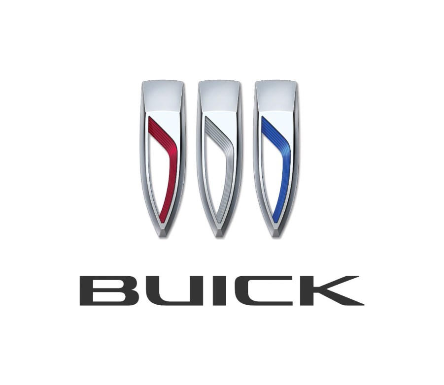
Buick’s New Logo Was Created on Accident
The Buick logo is an iconic symbol of American automotive history. Over the years, Buick has undergone numerous logo changes, each a reflection of the brand’s evolution and changing identity.
Buick unveiled a new logo that was created by accident but has since become the centerpiece of the brand’s image. The new logo is meant to represent a modern take on Buick’s heritage and is part of a larger effort to revitalize the brand and connect with a younger generation of buyers. Let’s dive deeper into the story behind the new Buick logo and how it came to be.

How did the new logo come about?
The story behind the new logo is quite interesting. According to MotorTrend, the logo was actually created by accident.
Buick’s design team used to sketch a simplified version of the logo, which consisted of three shields without any outline. The sketches were refined before presenting them to the management by adding the proper badge to give them a realistic touch.
However, one of the sketches was not cleaned up and caught the attention of GM President Mark Reuss. He was impressed with the stripped-down version, and a new tri-shield emblem was created.
Since the rest of the team loved the accidental design, they decided to run with it. Soon, all new Buick models will feature the redesigned logo.
Which new Buick models will feature this logo?
The tri-shield logo of Buick has been redesigned, which is the first time since 1990. Motortrend reports that this updated logo was initially seen on the electric Buick concept car, the Wildcat EV luscious 2+2 coupe, and it will be featured on all upcoming models.
The redesigned logo will debut on the 2024 Encore GX during its mid-cycle refresh, which will hit the roads in the next few weeks. Additionally, the logo will be seen on the new subcompact crossover, the 2024 Envista, during the summer.
Changing a logo is significant for any brand as it represents the company and serves as the most prominent link between all its new models.
What does this mean for the brand?
Buick hopes this new badging will help modernize the brand and attract a younger generation of buyers. If you’re familiar with the brand, you know it has struggled to connect with younger consumers in recent years. The new logo is just one part of a larger effort to revitalize the brand and make it more relevant to today’s buyers.
Will the Buick logo redesign be a good thing?
We’d like to think so! Buick is an American luxury vehicle brand that has been around for over a century, and the new logo is sure to turn heads on the road. Every time a new logo redesign surfaces, it signifies a significant shift in the company’s branding strategy.
It will be interesting to see how consumers respond to the new design and how it impacts Buick’s overall success in the automotive market.


