What Does the Corvette Logo Mean?
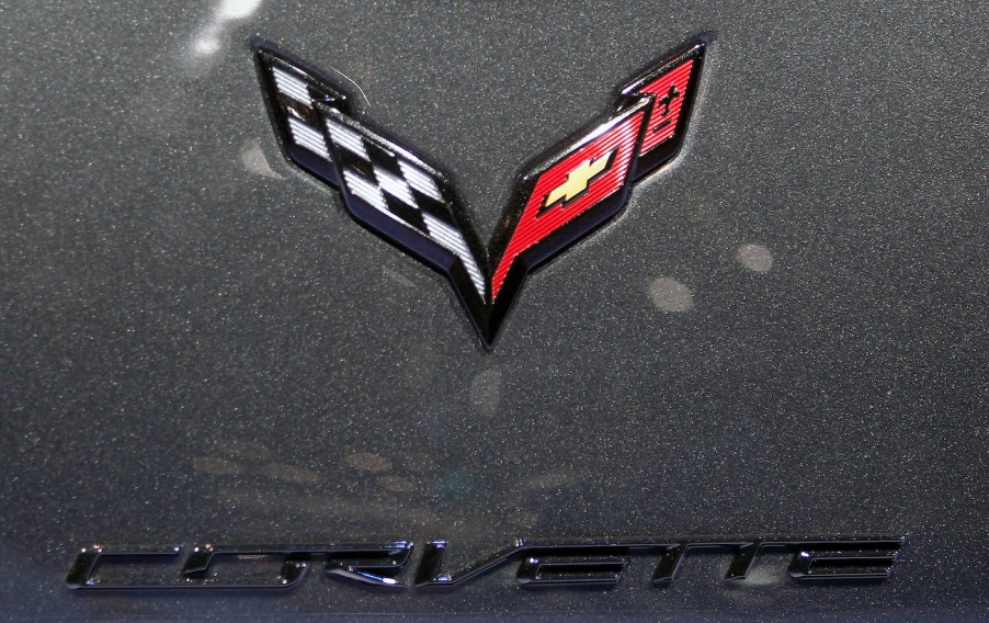
The Chevrolet Corvette is one of the most iconic and revered sports cars of our time. It’s been in the market since the 1950s, and we can’t imagine that it will be going away soon – especially since an EV model is set to arrive in the future. What’s almost just as iconic as the car itself is its logo – which features a pair of flags and symbols. But what does the logo mean?

A brief history of the Corvette logo

In order to understand what the Chevrolet Corvette logo means, we’ll need to take a little trip down memory lane. The original logo was designed in the early 1950s by Robert Bartholomew, the interior designer for the first Corvette model. Core 77 reports that Bartholomew’s first design featured two crossed flags: A checkered flag that symbolized race victory and an American flag to symbolize patriotism.
However, the legal department soon got involved and nixed the American flag idea because it was illegal to use it on a commercially-made product. Bartholomew then went back to the drawing board. This time, he used the Chevrolet Motor Car Company’s founder and Frenchman, Louis-Joseph Chevrolet, as his inspiration.
Chevrolet’s French roots seemed like a good starting point, so Bartholomew set out to find Chevrolet’s coat of arms or family crest, which he could use for the logo. After coming up short, the fleur-de-lis (the flower of the lily) was chosen to signify the founder’s French descent instead. The three lines below the symbol represent the three Chevrolet brothers.
The Corvette emblem changed over the years

The Chevrolet Corvette emblem has changed over the past few decades, but the changes were minor. The first revision saw enlarged versions of the flags and the elimination of the white background. Later on, Chevy got rid of the words “Chevrolet” and “Corvette,” substituting the word “Stingray” to coincide with the Mako Shark concept car in 1963. The circles were dropped, and the two flags were emphasized more.
Hot Cars reports that the Corvette logo went through a more dramatic change from the 1980s up to 1996. For this time period, the circular frame reappeared, the flag poles disappeared, and the fleur-de-lis was emitted as well. This time, the checkered flag was featured on the right side of the emblem, with the Chevy bow tie on the left.
In 1997, for the C5 Corvette, the fleur-de-lis showed up again next to the Chevy logo, as did the flag poles. For the subsequent C6 Corvette, Chevrolet removed the flagpoles again and incorporated a more modern V-shaped design. The badge used for the C7 Corvette utilized sharper lines and edges for a sleeker look.
And lastly, the current badge on the C8 Corvette looks a lot like its predecessor, but it is a little smaller.
Will the Corvette logo change in the future?

Considering Chevrolet has already teased images of the forthcoming 2025 Corvette EV, we can only assume that the American automaker will change the logo again. Maybe it will have lightning or electric shocks incorporated into it. Either way, we’re willing to bet that the checkered flag and fleur-de-lis symbol won’t be removed. After, they’re an important part of the logo’s history.


