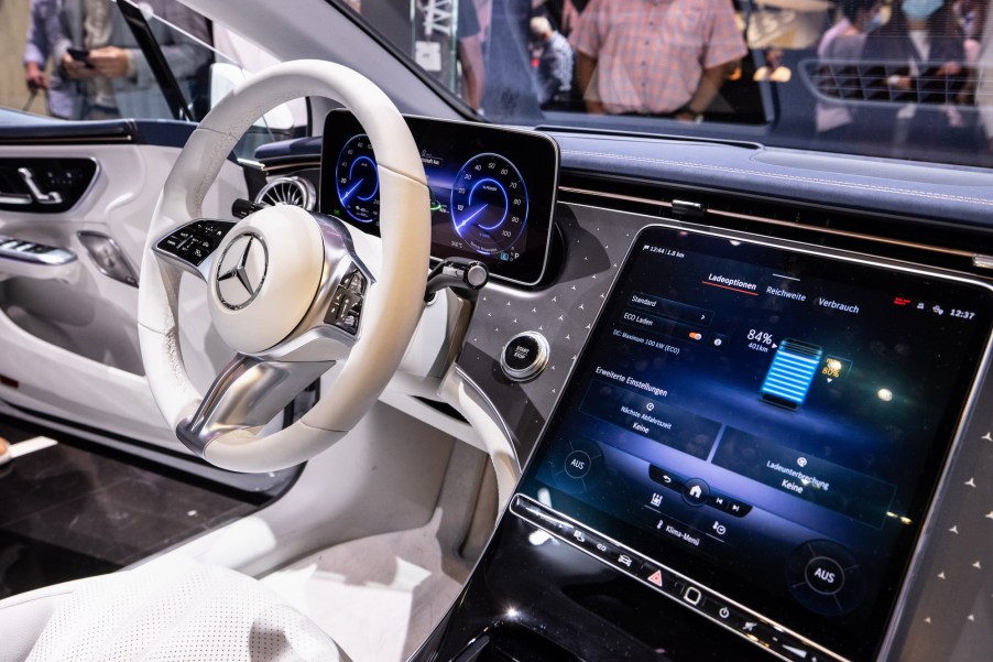
Is the Larger Infotainment Systems Coming up Make a More Distracted Driver or Not?
Back in the day, infotainment screens in cars were so small or nonexistent. Some of the most high-tech vehicles came with a cassette player, which was a huge step-up over the eight-track tapes of the seventies. We now have massive infotainment screens that take up most of the vehicle’s dashboard. We’ve gone from listening to epic rock music using these systems to playing video games. But is all this too much of a distraction?
Are our screens distracting us?

Whether it’s an update about road conditions ahead or the latest text from our mom, it seems impossible to leave our phones behind. Automakers realized this and are using infotainment screens to help keep our eyes on the road and not our phones. However, how does that work out when the screens are so large it’s impossible to ignore them?
This leads to the question of just how distracted these new, larger screens make drivers. It could be argued that being hands-free is a step in the right direction, but how does that translate to reality?
In an article released by WIRED, it’s not really as hands-free as the advertising may hint. Many of these screens require scrolling, touching buttons, and straining the eyes as we look at a font that’s too small and requires more attention than other important aspects of driving, such as looking at the road.
However, the data is a little blurred on this. In general, most distracted driving accidents are blamed solely on cell phones, and little attention is given to how infotainment screens may affect this. WIRED reports that the NHTSA recommends you shouldn’t look away from the road for more than two seconds, so this could be a personal test to know if your infotainment system is distracting you.
Apple is leading the way toward more massive screens
Forget a mere 12-inches of the dash; Apple is going big with this next update of the CarPlay system. In fact, this new era of infotainment systems will take up the entire dash.
According to WIRED, “There will be widgets. There will be choices of instrument cluster arrangements. Rather than simply mirroring an iPhone, CarPlay will let drivers change radio stations and also showcase vehicle data like fuel level and speed.”
All this sounds great, as we need to know how fast we’re going and how much longer we can drive before it’s time to head to the gas station. However, does it need to take up the entire dash? Apple seems to think so, and other manufacturers will quickly follow its example.
Manufacturers agree that bigger really is better
Love or hate them; it’s doubtful that infotainment screens will go the way of the eight-track. If they do, they will doubtless be replaced by something even more distracting.
With that being said, Apple tends to set the trends that everyone else tries to one-up. Android is currently the biggest competitor for Apple, but plenty of young engineers are dreaming up the next big thing.
How this translates into infotainment systems is easy enough to predict. They will continue to get bigger and better. The buttons most critics lament will doubtless be done away with, and touch screens will become just as common in infotainment systems as in cell phones.
So will tech companies find a way to make infotainment screens useful and distraction-free? Since a large part of the responsibility falls on the driver, that’s a little hard to predict. We’ll have to wait and see until we begin to get data proving that infotainment systems are a significant factor in wrecks caused by distracted driving.


