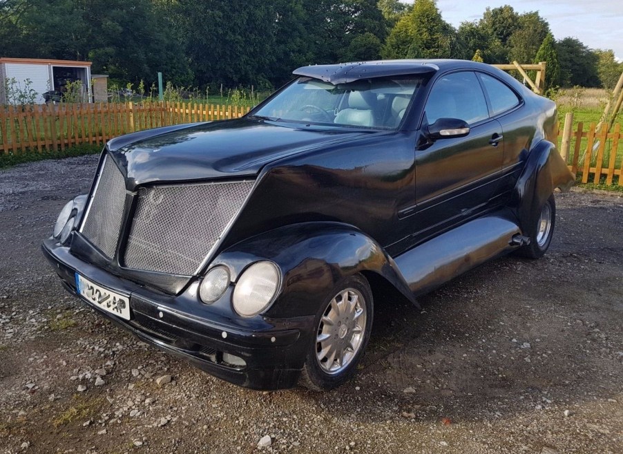
Could This Mercedes Be the Ugliest Car In The World?
With all due respect, this modified Mercedes CLK is hard on the eyes. Could this be the ugliest car ever? We don’t mean to trash people’s hard work and personal taste. But how could this have happened? A CLK mishmash of conflicting ideas and poor execution could be the best way to describe it.
Would you like to buy this modified Mercedes coupe?

We are usually fans of modification and restyled vehicles, be they cars, trucks, vans, or bikes. But this W208 CLK coupe is more of a spectacle than special. Executed in the U.K., it’s now on eBay, for those daring enough to own it. But since Mercedes enthusiasts are picky about their cars using factory equipment, they should be happy to know this is almost entirely Mercedes. The engine and driveline are all CLK, which means a stock 3.2-liter V6, transmission, and rear.
The body fabrication is metal, not fiberglass. Though it looks like it could be fiberglass. We don’t know whether that’s good or bad? The frame, however, is all “custom” made, with Mercedes components in the factory locations relative to the body. So we’re confused why the builder didn’t use the stock frame and then build a higher platform for the body. But what do we know?
What was the Mercedes coupe builder trying to do?

The seller says the fenders are all original, to give the car a “Coke bottle” shape. You know, like a 1968 Dodge Charger. In other words classic. Or not.
In front, the grille is a cross between a Peterbilt truck and a Zamboni machine The expanded metal mesh gives it an industrial look. And the stock headlights and fender forms make an attempt to visually tie into it.
Is the back as bad as the front?

If you thought the front was a little rough on the eyes, maybe you shouldn’t see the rear. Though the truck is larger and deeper than on a stock CLK, the trunk lid is tiny. We’re not sure why? We would have asked why was it designed like this? But we don’t want to associate “design” with anything about it.

And we also ponder why the fenders are so far away from the tires? Actually, why everything was done like it was is a mystery? We would have suggested that the trunk follow the lines of the trunk lid, tapering in as it moves down to the rear bumper. But obviously, the owner had his or her own thoughts about design and proportions.
Speaking of proportions, they’re pretty crazy. The height of the body makes no sense, nor do the fender forms below it. Nor do the straight lines of the trunk lacks any detail. Those panels between the running boards and body look pretty rough.
Was the builder trying to make this look like a particular car?

Then there are the V’d windshield visor and the almost entirely blanked-out rear window. There are only two sinister slits that are virtually worthless. In general, the large amount of work that went into this belies its appearance.
If we had to guess, this was an attempt to create a modern version of Queen Elizabeth II’s 1950 Rolls-Royce Landaulette? Otherwise, we have no clue what the builder was trying to accomplish? We guess we’d have to buy it to find out, and we’re absolutely not going to even entertain that thought.


