The Most Recognizable and Least Recognizable Car Brands May Surprise You
Most recognizable car brand logos are so common, that they blend into the background. You probably see the emblems so often that you don’t even notice them, even when you’re looking directly at the car in question. Because imagery is so important in the world of cars, those icons tend to change less often than in other industries. While some have started to switch things up, car brands with the most recognizable logos have kept their familiar looks for years.
A recent study puts car brands to the test

In response to Porsche’s subtle logo redesign, UK automotive research site Vanarama quizzed 1,000 people to see which car brand logos were most recognizable. Incredibly, the German brands BMW and Mercedes-Benz scored highest, with Toyota and Hyundai rounding out the top four.
While at first, it doesn’t seem surprising that the German emblems were at the top, the test methodology makes this all the more impressive. The research team subtly altered each logo and then asked participants to pick out the correct iteration.
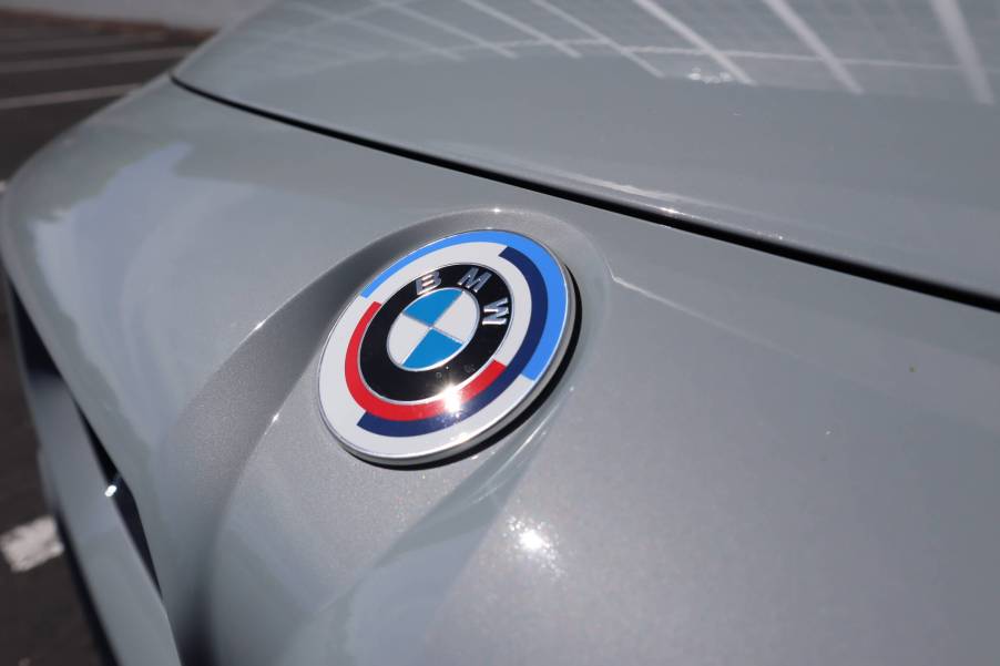
In the case of BMW, that meant moving the colors and subtly adjusting the font from the original. Truthfully, at first glance, I had a hard time realizing just how the logos were different. But in the end, 50% of those polled chose the correct version.
In the case of Mercedes-Benz, the emblem remained constant, but the Mercedes-Benz font changed with each iteration. Here, only 40% recognized the correct car brand, but that was still good enough for second.
Much like Mercedes, the Toyota logo remained while the text was altered. The result was 39% of participants choosing the correct emblem.
Hyundai had perhaps the most dramatic variation in this test. All three looked slightly different, stretching the stylized “H” and the font, with just 35% of pollees getting it right.
Which car brands are the least recognizable?

At the opposite end of the spectrum, we have Nissan, Ford, Honda, and Tesla. With Nissan, only 24% managed to choose the correct version. Ford, Honda and Tesla virtually tied, with 32%, 33%, and 34%, respectively. However, those three brands had much more subtle logo changes, and those percentages represent the same probability of randomly guessing which logo is correct, as opposed to making an informed decision.
What makes a recognizable car brand is more than the logo
While a company’s logo and wordmark are important to their brand, in the world of cars, the vehicle tells more of the story. BMW’s kidney grilles are just as important as the roundel. Tesla’s sleek curves are, arguably, more recognizable than the stylized “T” at this point in history.
On the other hand, brands like Ford and Mercedes-Benz have iconic emblems that are easy to recognize even out of context.
Kia is a case of car branding gone bad

Perhaps the one major highlight of an automaker’s branding going sideways is with Kia. Wanting an update from a dated and bland logo, the Korean automaker went with a modern Kia wordmark as its new brand.
Unfortunately, the new emblem looks more like a capitalized KN or, if you’re a metalhead millennial like me, a bastardized Nine Inch Nails logo. Such is the state of the problem that Google searches for “KN Car” surged by nearly 150% when the new logo hit the road.
Does this test reveal anything about car branding?
Because the logo changes were intentionally subtle, it’s hard to say that this study proves anything about any car brand’s standing. Minute changes to the Ford logo don’t affect the brand’s iconography. Ford itself has subtly tweaked the script-style font over a century of business. No matter what, the public will still easily associate that look with those cars, subtle emblem tweaks or not.


