Are These 2 Tesla Features Design Fails?
Fans, critics, and neutral parties have racked up hundreds of comments while they debate about a trending clip. The subject: two separate Tesla features in action. The video and comments are embedded below. Let’s go over the two Tesla features that some are calling total failures.
Is swiping to shift a good or bad Tesla feature?
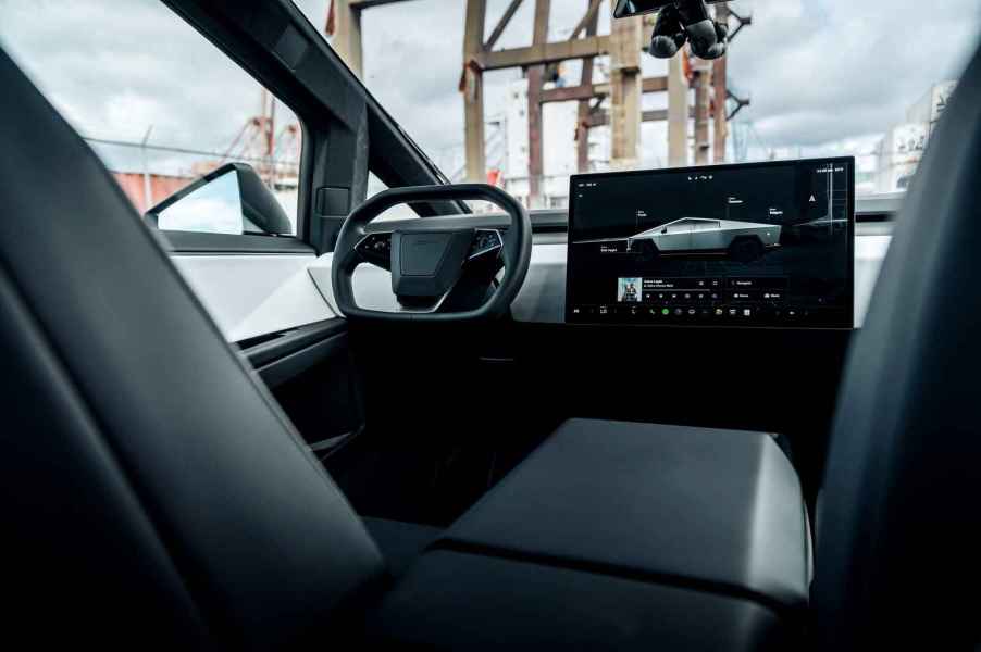
The first cited Tesla feature is its “swipe to shift.” While the video circulating is of a Tesla Model 3, other Teslas also use “swipe to shift” technology. This includes the Cybertruck.

According to Tesla’s owner manuals, when you press the brake pedal when parked, the drive mode strip will appear on one side of the touchscreen. Then, you can use the drive mode strip to shift the vehicle. You swipe up for Drive, swipe down for Reverse, or touch the P for Park or N for Neutral. Swipe from the edge of the touchscreen towards the passenger to bring up the drive mode strip.
The video shows how a driver might find themselves swiping over and over to navigate out of a tricky space. Some commenters agree that this seems very impractical, but others point out that the video exaggerates most realistic driving situations. What’s more, others say that once Full Self-Driving (FSD) becomes widely used, drivers won’t need to shift at all. The car will do it for them.

We can see how looking at a screen to swipe in order to navigate could be slightly distracting. Many folks can simply find their shifter using muscle memory. The conversation moves right into how safe and beneficial digital dashboards are compared to tactile controls.
Teslas do have another way to shift gears. There are buttons in an overhead console above the rearview mirror that the driver can push to shift.
Are Tesla’s turn signal buttons, located on the steering wheel, a good or bad feature?
Another highlighted Tesla feature is the turn signal placement. The turn signals on Teslas are located on the face of the steering wheel. This position is where other automakers have their infotainment controls, like volume and call buttons.
The video shows how one Tesla driver put clear adhesive dots on the steering wheel. The dots work almost like braille and are more easily felt without having to glance away from the road.
The video shows how difficult it might be to press the turn signal buttons while driving, like when the wheel is already turned.
Like the shifting technology, commenters either agreed with the video or shrugged off the criticism.
One commenter spoke up, saying that just because something is designed differently, it doesn’t automatically mean it’s bad.
We tend to agree with that commenter – as long as features are truly serving the driver and ensuring the safety of everyone in and near the car, new tech shouldn’t be automatically dismissed.


