The 2020 C8 Corvette’s Worst Aspect Gets Nailed in This Bloomberg List
A good car can have a sub-par interior, but it’s harder for a car to be truly great without a decent interior. I doubt it needs pointing out, but the interior is where we are. It matters. Race cars have bleak interiors because they are tools designed for a specific task. Every-day road cars, however, don’t need buttons covering every inch, harsh dividers, and a cockpit designed for the one-way function of a space shuttle. Well, the 2020 Corvette C8 seems to have missed all that and went ahead and did it anyway.
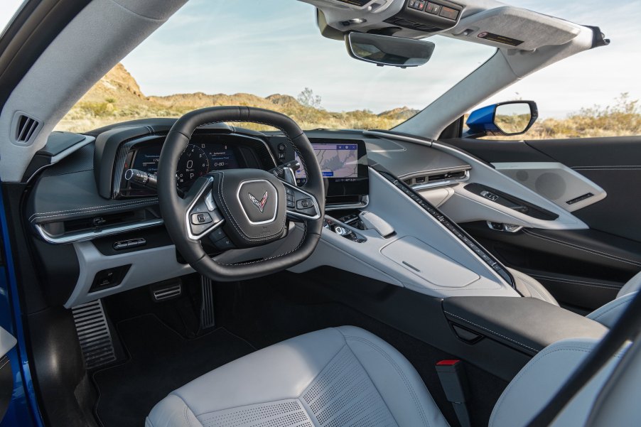
Hannah Elliott at Bloomberg laid out a concise list of the worst car interiors of the year, and guess who shot to the top of that list – the C8.
The 2020 Chevy C8 Corvette is pretty… from the outside
The 2020 Corvette is undoubtedly a wonderful thing to look at it. Chevy really went to the mat on this one and we all appreciate it. But, that doesn’t mean they had to completely forget that humans had to sit inside the thing.

The Great Wall of Chevy
Elliott points out that the long, dividing center console is intrusive and isolating. This is an interesting take, and I think she has a point. Long gone are the days of bench seats in trucks and sedans. It used to be that the driver wasn’t separated from passengers at all. Although this wasn’t the most practical or safest cabin design, it was endearing and very human. The 2020 Corvette’s button-smattered retaining wall is the cold and robotic opposite of the snuggle-friendly bench seat from yonder olde-timey days.
She goes on to lay out two reasons why the cuddle killer console (patent pending) lands the C8 on the list of worst car interiors of the year. The first reason is it completely kills the flow of the interior. Well, yeah. They damn near built a wall down the center of the car. And, secondly, the Great Wall of Chevy is covered in buttons.

I can admit, I have a rather grandpa-ish take on car tech and button layouts, but I think more motorists agree than not. Sure, a bazillion buttons for all sorts of extra nonsense is fun at the auto show, or the car club meet up when someone shows up a 16-switch El Camino. Still, for everyday driving, all those buttons are simply distracting and unnecessary. Of course, this is a bit of a generalization. There is plenty of button-controlled features that offer safety and a bit of good fun, but the C8 went a little too far.
Don’t be a square
The complaint train keeps rolling. I agree with Elliott, as this being one of the 2020 Corvette’s ugliest features; the steering wheel. She describes it like this, “The square steering wheel split from the center by two drooping spokes looks as if it were borrowed from Buick.” Savage, but true. I’m sorry, Chevy, but the C8 isn’t a race car. It’s fast and plenty capable, but folks are still just going to go to work or school, or maybe even the store in a C8. A square steering wheel is just impractical. Imagine doing a three-point-turn or parallel parking with that thing.
Lastly, and most importantly, the visibility from the cabin is minimal. Again, this makes sense for a racing driver on track, but less so when you drive down the highway and need to, you know, see. Everything in C8 seems to be solely focused on the driver and no one else.
Many might see the focus on the driver as a positive mark for the 2020 Corvette, but I’m not sure it is. Every screen, dial, and button (of which there are many) is pointed at the driver, and the visibility is low in any direction other than forward.
As the Bloomberg article points out, what about the passenger? Do they play any role in the experience of the car? It would seem not. And, what’s the point of a fancy sports car if the experience is not meant to be shared?
Car interiors are a delicate bit of design, especially for sports cars. Many conflicting factors have to be taken into consideration, like weight versus comfort and aesthetic versus function. It’s a tough line to walk, but not impossible.


