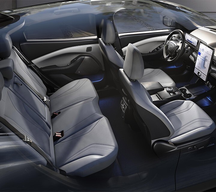
The 2021 Ford Mustang Mach-E Interior Out-Teslas the Model Y
Ford is one of the oldest car companies in the world, and Tesla is one of the newest. In the race toward electric SUV domination, it’s funny to see grandpa stealing from the child. I guess it is harder to change course for a bigger, older ship. Either way, the Ford Mustang Mach-E just totally ripped off Tesla’s interior, but like, a little better.
The 2021 Ford Mustang Mach-E is more Tesla than Tesla
One of the more recognizable design features of the Tesla Model 3 and Model Y is the iPad looking center console and infotainment screen. Welp, Ford just jacked it and made it bigger. The Tesla Model Y has been running the table on all-electric SUVs. Ford surely took note and made a point to give the people what they seem to want; huge screens.
The design influence doesn’t just stop at the massive touch screen; it’s the whole thing. Tesla intentionally made the dash of the Model Y plain and minimal because the focus was on the tech and, as a result, the massive interface to interact with that tech. The Ford Mach-E has clearly taken the same approach but with a little more personality and flair.
Let’s take a look at the interior
Starting at the front, as we’ve mentioned, the dash is clearly a page from Tesla’s book. The friendly old pony is proudly plastered all over the car in various light-up and non-luminescent badges.

The dashboard topper sports a little throwback easter egg. Like the Mustangs from the ‘60s, the Mach-E has a slight dip in the middle behind the gauge screens. According to MotorTrend, it’s a call back to the old Mustang’s dashboard’s dual-binnacle design. And thaaaaat’s about all the Ford influence you get. The rest comes from Tesla.
The Mustang Mach-E that was tested by the folks at MT had the super cool optional B&O soundbar. This is a touch of flair not found in the Teslas. The materials throughout the cabin are varied to largely avoid the plastic-y materials that often plaque moderately priced EVs. There is a mixture of cloth, carbon fiber-looking plastic, and brushed aluminum.
The Mustang Mach-E has the Tesla screen, but better
I think the part that makes it look so Tesla-y is the fact that it is in portrait layout. This was such an iconic design flaw of the first model S that it still holds as a Tesla look in the Mustang. Unlike the Teslas, the Mach-E also has a smaller landscape screen behind the steering wheel that shares the interfacing duties allowing the big dawg to be more useable.

MotorTrend says that the Mustang’s big screen is mainly used to run Ford’s Sync 4A software. This new software is said to blend Tesla’s elegance with a more traditional and friendly interface. Some parts are a little more traditional than the Tesla counterparts. MT specifically mentions the clever volume knobs that sit atop the screen. The knob makes it look like you are drawing circles with your fingers on the screen. A bit of fun from grandpaw.
The Mustang departs from Tesla Design cues
Thankfully, the steering wheel utilizes real buttons and not some overly complicated touch bar or some such. The steering wheel keeps things nice, simple, and easy to use. The Mach-E went with a normal start/stop button instead of the Tesla Model Y’s ability to be ready to roll the moment you are seated.
More Tesla features incoming. In the center console area, underneath the big screen, is a chagrin pad for your phone. Pretty cool, except, unlike Tesla’s two-phone charger, there is only space for one in the Mustang Mach-E.
The back seat of Mustang is good for the first time since – ever
The coolest part of all is something that all EVs have in common. Because there is no engine or transmission, the floor in the back can be completely flat. If you get stuck in the middle on the family road trip, you aren’t ridding the hump the whole time. This is the unsung hero of the EV, right here. The problem with the Mach-E is that the sloping roofline cuts off much-needed headroom and window height. Like any good SUV, the Mach-E got back. The trunk area has tons of room for plenty of luggage and gear.
Overall the verdict seems to be that the Ford Mustang Mach-E put together a nicer interior than the Tesla Model Y. This is an impressive feat for Ford. However, it better still keep one eye open cause everyone knows Elon is never too far away with a new wild idea.


