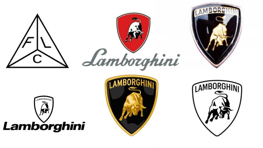
The History of the Lamborghini Logo
It’s one of the most instantly recognizable badges in all of car culture: the raging bull aboard the Lamborghini emblem. However, Ferruccio Lamborghini and company didn’t start with the bull or the iconic shape we know and love today. No, the Lamborghini logo evolved over more than 70 years from initials and script to the latest redesign for 2024.
Since its founding in 1953, Lamborghini has used six logo and emblem derivations on its performance cars and SUVs
The first badge could prompt modern hypercar fans to scratch their heads in confusion. It was an upright equilateral triangle with three small triangles within. Each of those triangles contained an F, an L, or a C representative of “Ferruccio Lamborghini Cento.” However, that badge took a back seat to the iconic Lamborghini script and upside-down red triangle logo after Automobili Lamborghini got its official founding in 1963.
The familiar raging bull with the “LAMBORGHINI” banner didn’t find its way onto cars until 1972. Lucky for the updated badge, it was in time to live on the fascia of the iconic Lamborghini Miura SV and SVJ supercars. However, the next evolution of the badge enjoyed a tenure of over 20 years from 1974 to 1998.
Rather than sticking with the minimalist badge and inset banner, the storied performance marque added a clean, period-apropos typeface under the badge. It’s the look so many ‘80s and ‘90s kids grew up with adorning posters of the utterly excessive Lamborghini Countach and Diablo supercars. You know who you are.

In 1998, however, the brand adopted its familiar and simplified badge, reminiscent of the short-lived early 1970s emblem. More recently, Automobili Lamborghini announced the first update to the iconic raging bull badge in over 20 years. However, the update isn’t exactly an overhaul. Instead of a major reimagining, the bull on the guitar pick-shaped emblem ditches much of its three-dimensional appearance and adopts a (slightly) different typeface. Read about it here!


