What Is the True Touchpad Interface, and Why Do Acura Owners Hate It?
Acura is a luxury car brand owned by Honda, and one of the ways that Acura has been trying to compete in the luxury car segment has been with its infotainment systems. Acura’s latest infotainment system was introduced a few years ago, and it’s called the True Touchpad Interface. Acura hoped it would strike a balance between touch screens and physical controls. Unfortunately, Acura owners aren’t too sold on the True Touchpad Interface, and here’s why.
What is the True Touchpad Interface and how was it designed?
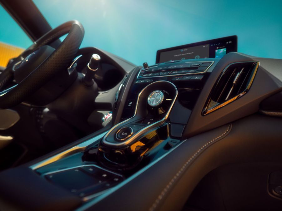
As J.D. Power wrote, Acura’s True Touchpad Interface, or TTI, has a unique design compared to the interior controls of most other cars. Most other cars have a regular touch screen or physical buttons, and both options are simple enough for most folks to understand. Other vehicles come with a rotary dial or a trackpad, and while these may be somewhat familiar for folks, they are typically hard to use.
Acura’s TTI, meanwhile, has a touchpad, but unlike other touchpads, it doesn’t react to swiping motions. Instead, the TTI will respond to where on the touchpad it’s being touched. This means that folks who are used to using a laptop trackpad will need to forget those instincts, as even though the TTI looks like a laptop trackpad, it doesn’t work like one.
Instead, a touch on the TTI’s touchpad will correspond to a touch on the same location on the Acura’s infotainment screen. However, the TTI has a second, smaller touchpad next to the central touchpad. The smaller touchpad is used to scroll through supplementary info displayed on the screen, such as audio info and the time.
This is why Acura owners hate the True Touchpad Interface

Acura calls this “absolute positioning technology,” and while it’s unique to the TTI, Acura owners hate the system. The TTI is often considered one of the worst infotainment systems offered in a car. Unsurprisingly, the main complaint that most owners have with the TTI is how it’s counterintuitive to what most expect from a touch screen or a trackpad.
J.D. Power wrote that this might have to do with the fact that everyone has a smartphone nowadays, and a smartphone’s touch screen has become the standard way for a touch screen to work. This is the main complaint that Acura owners have with the TTI, but it’s a major complaint as ease of use is one of the most critical factors regarding learning controls. Most folks don’t want to get used to how their car does things, and the TTI forces folks to learn.
That said, there are other smaller issues, according to AutoEvolution. For example, there’s no cursor on the screen, which can be annoying for anyone who’s used to them. Another minor and annoying issue has to do with scrolling through long menus. With a regular touch screen, folks can swipe in a direction to scroll through many items. With the TTI, however, they will need to repeatedly tap the buttons.
The TTI can be a rewarding feature to learn
Once folks learn to use Acura’s TTI, it can become a rich infotainment system. Like many automakers, Acura has realized that car shoppers still want some physical controls to go with their infotainment screens, and the TTI tries to combine those two systems together.
For example, on top of the touchpad are “Home” and “Back” buttons that allow folks to navigate the system’s menus more easily. Plus, the menu items are usually pretty large, so it’s easy to select them.


