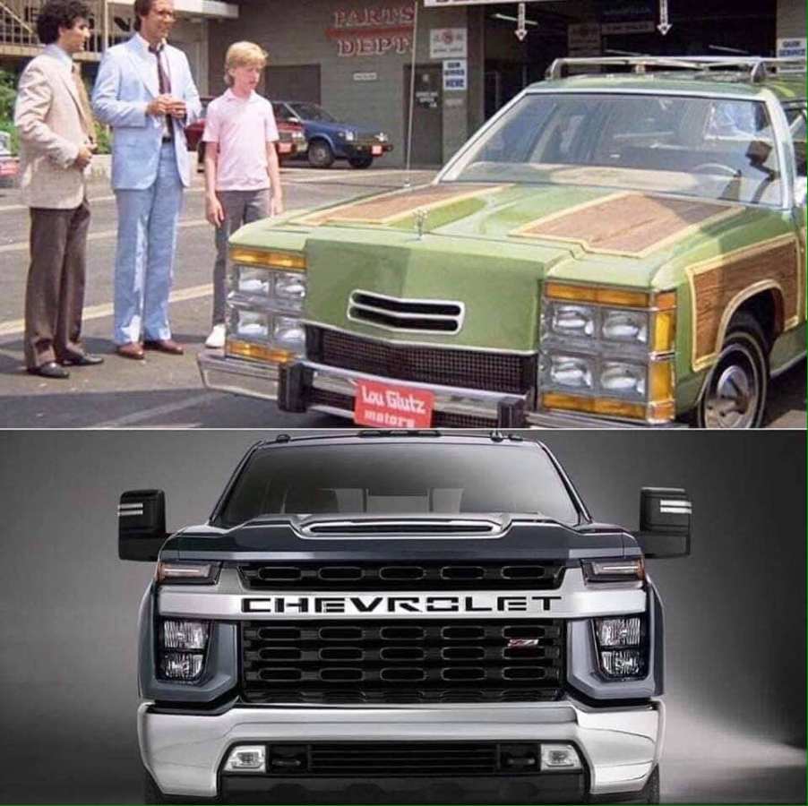
UGLY: Those New Silverado Front Ends
The hate for Chevy’s Silverado and 2500 pickups over its front end design just doesn’t seem to stop. We’re over one year into the new design that GM had to get right, and it didn’t. How can this happen? Which part, the design or the hate? We’ll look into both.
All of GM is killing off cars as fast as it can for pickups and SUVs. GM even has two divisions making virtually the same truck it’s that important to them. (By the way, if you know the difference between a Chevy and GMC pickup please let us know as we can’t figure it out.) So how much of a disconnect must there be between design staff and those of us buying the product?
GM’s golden opportunity to narrow gap with Ford sales

GM had a golden opportunity to gain some sales from Ford as its new design was preceding Ford’s by almost two years. This truck had to be bold, with better performance, economy, options, and a more upscale interior. It nosed-over in all of these categories. Now Ram has beaten Chevy trucks in sales to take over 2nd-place.

So what happened? The truck wasn’t 25 hours old when the first negative waves started wafting over the pickup truck’s launch. And they were all focussed on the front end only a mother could love. Or not.
Facebook exploded over the ugly Silverado front
Though every truck site on Facebook exploded in the days and weeks after the posting, it hasn’t calmed down much since then. In baseball, the grand slam the night before against your team is forgotten the next night. With the Silverado front end, it’s not going away.

What can GM do about it? In the short term not much. It can hide some of the offensiveness by using body color or more matte black to disguise some of what’s happening. It could also redesign the plastic and headlight components which would be cheaper than making sheetmetal changes after just one or two years.
Maybe GM should embrace Silverado’s ugliness
From a marketing standpoint, it could play up the ugliness of it, much in the same way Volkswagen did back in the 1960s. Volkswagen would regularly run funny ads about its looks or size. This was some of the best advertising of the era, winning a ton of awards.

Of course, the long term result should be taking a hard look at how GM does its designing. If it relies on “clinics” to get feedback from Joe Lunchbox, maybe it shouldn’t be putting as much faith into this method as it might. It would be interesting to see how this design got through all of the checks and approvals.
Design disconnect
There must be a huge disconnect between the consumer and those making decisions at GM. Otherwise, the most important vehicle in GM’s portfolio would have been a hit. It had to be, but it hasn’t turned out this way.

Before the popularity of trucks started going crazy in the 1980s pickups didn’t have to be stylish. Heck, they didn’t have to exhibit any style at all. It was recognized this was like a farm implement. A car could convey different things about its drivers. A Volkswagen sedan gave a whole different impression than a Cadillac Eldorado. But a pickup truck was a pickup truck. As we are seeing now, that is not the case anymore.


