Why Are Automakers Replacing Buttons With Touchscreens?
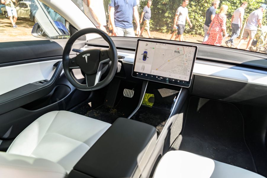
Even some of the worst infotainment systems on the market have touchscreen displays. It’s rare, in fact, to find cars nowadays that lack them. Indeed, Tesla’s EVs are famous for having little-to-no physical controls. Instead, the majority of the vehicle’s functions, even its windshield wiper controls, are found on the touchscreen. However, not every car buyer likes this approach.
Larger touchscreens mimic smartphones—and they’re losing buttons, too

In a recent r/Cars sub-Reddit thread, user u/Snazzy21 asked that “automakers please stop replacing buttons with touch screens.” As of this writing, said thread has 22.3k up-votes. And this isn’t necessarily an idle complaint. According to Consumer Reports, roughly 98.8% of all new cars sold in the US have a touchscreen display. So, what’s the reason for ditching physical knobs?
Part of it is that car infotainment systems aren’t just radios anymore, Ars Technica explains. In addition to audio controls, we have GPS navigation, Bluetooth, and things like Apple CarPlay. The sheer number of physical controls needed to control all that would be overwhelming—and overwhelmingly costly, MotorTrend reports. So, instead, we have simpler, sleeker, and cheaper touchscreens.
Speaking of Apple CarPlay, modern smartphones like the iPhone are also partially to blame for the touchscreen takeover, Popular Mechanics explains. As touchscreens have grown in size and sophistication, physical buttons became all but unnecessary for most interactions. Once the screen is big enough, the user can just point and click on an app itself, rather than using a scroll wheel and a click.
And because consumers use smartphones so much, interior designers decided to mimic their design, NPR reports.
Pivoting too far away from physical controls to touchscreens can cause problems

To be fair, too many buttons isn’t good, either, AutoExpress reports. Such was the case for earlier Porsche Panameras. MT described the luxury car’s control layout as a “sea of buttons.” Lexus’ touchpad-based infotainment controls have been constantly critiqued for their lack of user-friendliness.
And non-touchscreen infotainment displays often look dated due to their screen technology, Autotrader reports. Such is the case when comparing new and used Bentley Continental GTs. And it’s why an $8-million Bugatti Divo doesn’t have a big screen. However, a car interior solely reliant on a touchscreen means dealing with potentially annoying or even dangerous consequences.
Tesla in particular is struggling with this. When it couldn’t find an automotive supplier with a large-enough screen, it went with an ‘industrial-grade’ one, The Drive reports. But even those touchscreens couldn’t withstand the rigors of everyday driving. Given that virtually all of a Tesla car’s functions run through the touchscreen, that’s a problem. As a result, owners have filed lawsuits, and the NHTSA has opened an official investigation.
But a touchscreen doesn’t have to fail to cause problems. That’s something the US Navy discovered when it introduced more touch-sensitive displays in its ships, Automotive News reports. Larger screens mean more information, to the point where it becomes confusing and distracting. That’s why touchscreen displays were blamed as the cause for the collision between the USS John S. McCain and a tanker from Singapore.
That’s the biggest problem with replacing physical controls with touchscreens, Car and Road & Track explain. It draws your eyes from the road, and in many cases, causes you to “inadvertently turn the wheel,” Jalopnik reports. Plus, with little-to-no physical feedback, you have to look at the screen to confirm your activation. And industry research has shown that it’s significantly easier to locate a physical control than hunting through sub-menus, MT reports.
Are any automakers resisting this trend?
Admittedly, there are some situations where touchscreens are superior to physical knobs, Automobile concedes. But that doesn’t mean such controls should be ditched entirely. And luckily, a few automakers have realized this.
Honda, for example, received so much criticism over removing physical volume and HVAC controls that it put them back in. Mazda rearranged its infotainment system so more information appears on the heads-up display or the driver’s gauge cluster. And, naturally, it’s keeping its physical controls.

But it’s perfectly possible to combine sleek touchscreen design with physical knobs. The new Ford Mustang Mach-E is a good example of this. Ford wanted to make it look as if the volume knob pokes through the screen, MT explains. But instead of investing lots of money into developing a screen with a hole in it, the company did something simpler.
That knob isn’t actually a mechanical control. It’s glued in place and has capacitive-touch controls underneath. So, basically, it’s a physical control that the touchscreen thinks is your finger.
See? Buttons and screens can work together in harmony.
Follow more updates from MotorBiscuit on our Facebook page.


